Color and print are often the first things you notice about a swimsuit, and they can change how you feel in it just as much as the cut does. The right shade can make you feel bright and energized, while a print you love can make a simple suit feel special. The wrong one can leave you feeling washed out or like the suit is wearing you.
There are no strict rules here, and you should ignore anyone who says certain colors or prints are off-limits for certain bodies. What follows are practical principles to help you choose shades and patterns that make you feel great, so you can shop with confidence.
Quick takeaways
- Colors you already love wearing near your face are a reliable starting point for swimwear.
- Your skin’s undertone can guide you toward warmer or cooler shades, but it’s a guideline, not a rule.
- Print scale and placement change the overall effect more than the print itself.
- Light colors may be more see-through when wet, so check lining and fabric weight.
- The most flattering choice is the one that makes you feel confident.
Start with colors you already love
Before thinking about color theory, look in your closet. Which tops, scarves and dresses do you reach for again and again? Which colors earn you compliments or make you feel most like yourself? Those shades are a reliable place to start, because they already work with your skin, hair and personal style.
Swimwear is often worn in bright, direct sunlight, which can intensify some colors and wash out others. So a color you love indoors may look slightly different on the beach. If possible, check a new suit in natural daylight before you commit.

Using undertones as a guide
Skin undertone is the subtle hue beneath the surface of your skin. It stays the same whether you’re pale in winter or sun-kissed in summer, and it can help explain why some colors seem to make you glow while others fall flat.
How to find your undertone
- Check your veins: in natural light, veins that look greenish can suggest warm undertones, while bluish or purplish veins can suggest cool undertones. A mix may suggest neutral.
- Try gold and silver: if gold jewelry looks especially good on you, you may lean warm. If silver does, you may lean cool. If both work, you may be neutral.
- Hold up white fabric: if pure white looks bright and crisp next to your face, you may lean cool. If soft ivory looks better, you may lean warm.
These tests aren’t scientific, and many people get mixed results. Treat them as a starting point for experimenting rather than a definitive answer.
Colors that often work with each undertone
| Undertone | Shades to try | Neutrals to try |
|---|---|---|
| Warm | Coral, terracotta, mustard, olive, warm red, turquoise | Chocolate brown, camel, cream |
| Cool | Cobalt, emerald, fuchsia, lavender, berry, icy pink | Navy, charcoal, crisp white |
| Neutral | Most shades, especially jade, dusty rose, soft teal | Black, taupe, soft white |
Remember that saturation matters too. Some people shine in bold, bright colors, while others feel better in softer, muted versions of the same shade. If a bright coral feels like too much, a dusty coral might be perfect.
Solid colors: simple and versatile
Solid swimsuits are timeless and easy to style. They let the cut and details, such as ruching, hardware or an interesting neckline, take center stage. They’re also the most versatile choice for mix-and-match bikinis.
- Black: classic, sleek and easy to pair with any cover-up. It also tends to show wear, fading and sunscreen marks less than many colors.
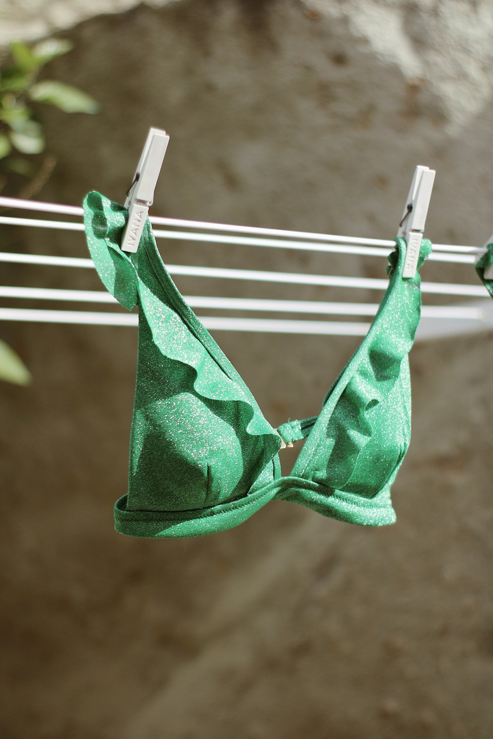
- Jewel tones: emerald, sapphire and ruby look rich in sunlight and work across many skin tones.
- Brights: hot pink, orange and cobalt feel fun and summery, and are easy to spot in the water.
- Soft neutrals: sand, blush and taupe look relaxed and elegant, though very light shades may need good lining.
Pro tip: Very pale colors like white, cream and light yellow can become more see-through when wet. Look for fully lined suits or double-layer fabric, and check the product description for lining details before you buy.

Choosing prints that suit you
Prints add personality and can create different visual effects depending on their scale, contrast and placement. There’s no print you “can’t” wear. It’s more about understanding how each one behaves so you can choose the effect you want.
Print scale
Small, dense prints like ditsy florals or micro geometrics read as texture from a distance and tend to feel subtle. Large, bold prints make more of a statement. A common guideline is to balance print size with your frame, but plenty of petite people love a big tropical print and plenty of tall people love tiny polka dots. Try both and see which you prefer.
Contrast
High-contrast prints, such as black and white stripes, draw the eye strongly. Low-contrast prints, like tonal florals or soft watercolors, feel gentler and more blended. If you want a print that feels easy to wear, start with low contrast.
Direction and placement
Vertical and diagonal lines tend to draw the eye up and down, while horizontal stripes draw it across. Placement prints, such as a pattern concentrated on one area or color blocking with darker side panels, can highlight or balance different parts of the body. The eye naturally goes to areas of brightness and pattern, so you can use that to spotlight whatever you like most.
Popular prints and how to wear them
- Florals: endlessly versatile, from delicate vintage-inspired prints to oversized tropical blooms.
- Stripes: nautical and crisp. Thin stripes feel subtle; wide stripes feel graphic.
- Animal prints: leopard and snake prints act almost like a neutral and pair well with solid black or brown.
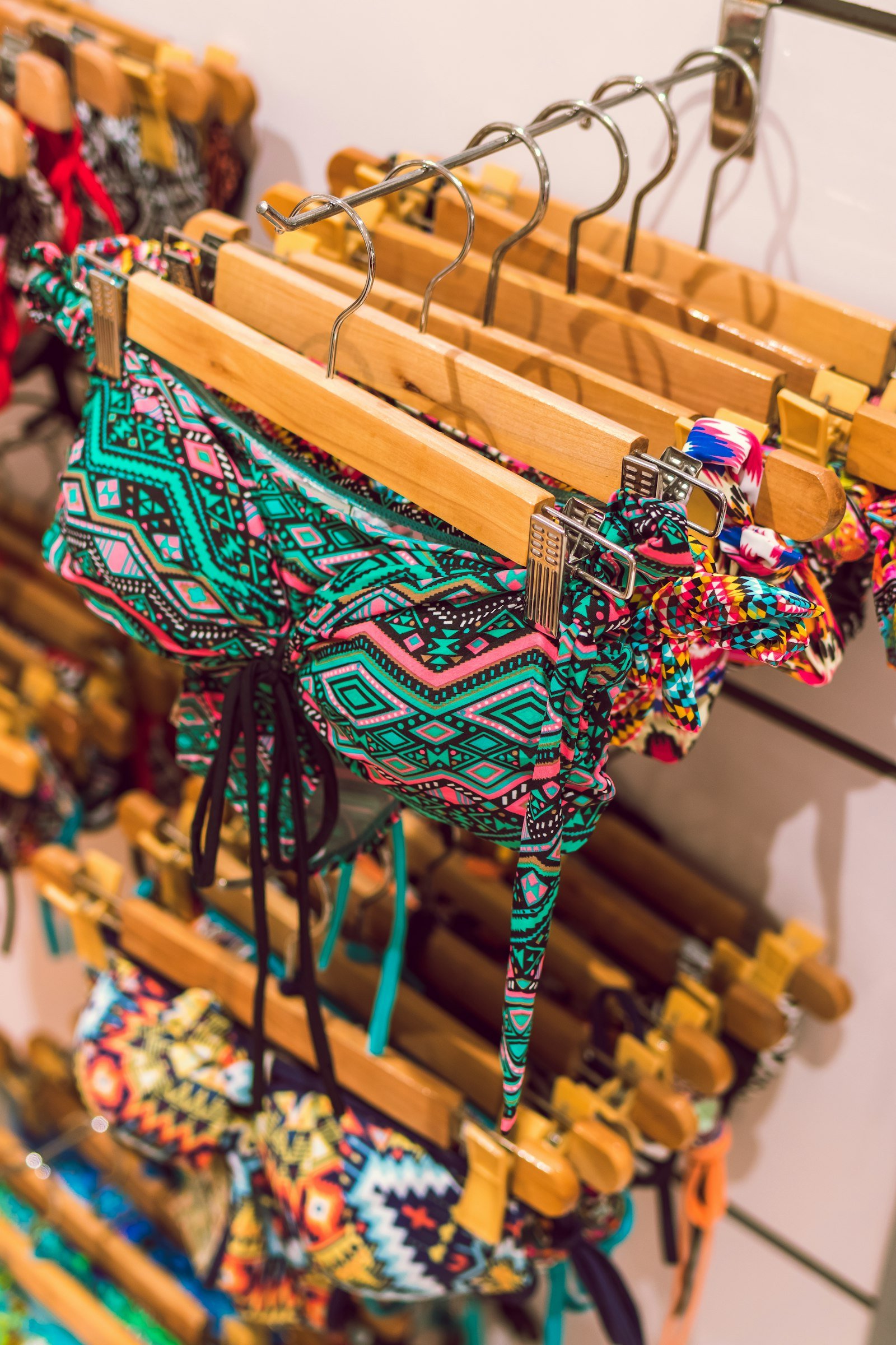
- Geometrics: modern and playful, and often great for sporty styles.
- Polka dots and gingham: retro and cheerful, especially with high-waisted bottoms.
Mixing colors and prints in a bikini
One advantage of bikinis and tankinis is that you can pair different pieces. A few ideas that work well:
- Print with solid: pull one color from a printed top and match it with a solid bottom, or the reverse.
- Two solids: pair complementary colors, such as navy and coral, or different shades of the same color.
- Two prints: mix prints of different scales that share a color, like a small stripe with a large floral.
Some people like to put a brighter color or print on the part of their body they want to highlight and a darker solid elsewhere. It’s entirely up to you. For more on which styles suit different shapes and priorities, see our guide on choosing a bikini for your body type, and for mix-and-match ideas when traveling, our beach vacation swimwear packing list.
Practical considerations
Beyond looks, color affects how a swimsuit wears over time:
- Fading: sun and chlorine fade color over time. Bright and dark shades can show fading more visibly, while prints often disguise it.
- Sunscreen stains: some sunscreens can leave marks on light fabrics. Applying sunscreen and letting it absorb before putting on your suit helps.
- Visibility: bright colors are easier to spot in the water, which can be reassuring for open-water swimming.
Rinsing your suit after each wear and drying it in the shade helps colors stay vivid longer. Our guide on how to care for your swimwear has more tips.
FAQ
Is black always the most flattering swimsuit color?
Black is popular because it’s classic and easy to style, but it’s not automatically the best choice for everyone. Many people look and feel fantastic in color, so it’s worth experimenting.
Do horizontal stripes make you look wider?
Horizontal lines do draw the eye across, but the effect depends on stripe width, spacing and contrast. Plenty of people love wearing them. If you like stripes, wear stripes.
Will a white swimsuit be see-through?
It can be, especially when wet. Choose a fully lined or double-layered suit, check the product details for lining, and test it with water at home before wearing it out.
What colors look good with a tan?
Bright whites, corals, turquoise and jewel tones often look striking against sun-kissed skin. But your undertone still matters, so use it as a guide when choosing between shades.
Choosing swimsuit colors and prints should feel fun, not stressful. Start with the shades you already love, use undertones and print scale as helpful guides, and don’t be afraid to try something new. The most flattering color is the one that makes you smile when you catch your reflection.